Miscellaneous Layout Design
One of my favorite things to do is typesetting because it’s like a satisfying puzzle to solve that I make myself. Whether it’s vinyl center labels, posters, books, booklets, business cards, trackslists for vinyl, CDs, and tapes, promotional material, or anything in between, I’ll find the font and type layout (even hand drawn type!) that each project needs.
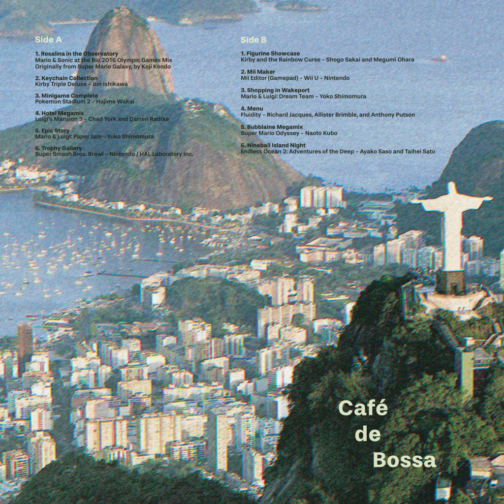
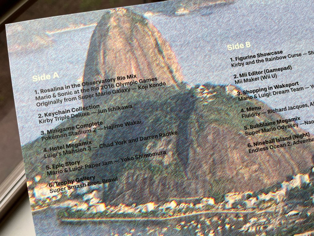
This was a trickier project than meets the eye because of how the type could easily blend into the background on account of how the filter looked—I initially had all the type in the water, but this created an imbalance that didn’t feel right. Since black and white (even black stroke white text) didn’t work, I decided to sample some colors from the photo and finally that dark green and light greenish cream were the right combo. It’s super subtle, but after all the different revisions I attempted it was was the right move. Because this tracklist was for a bossa nova VGM compilation I chose a font from a Brazil-based type foundry just to have that extra dash of intention behind it.


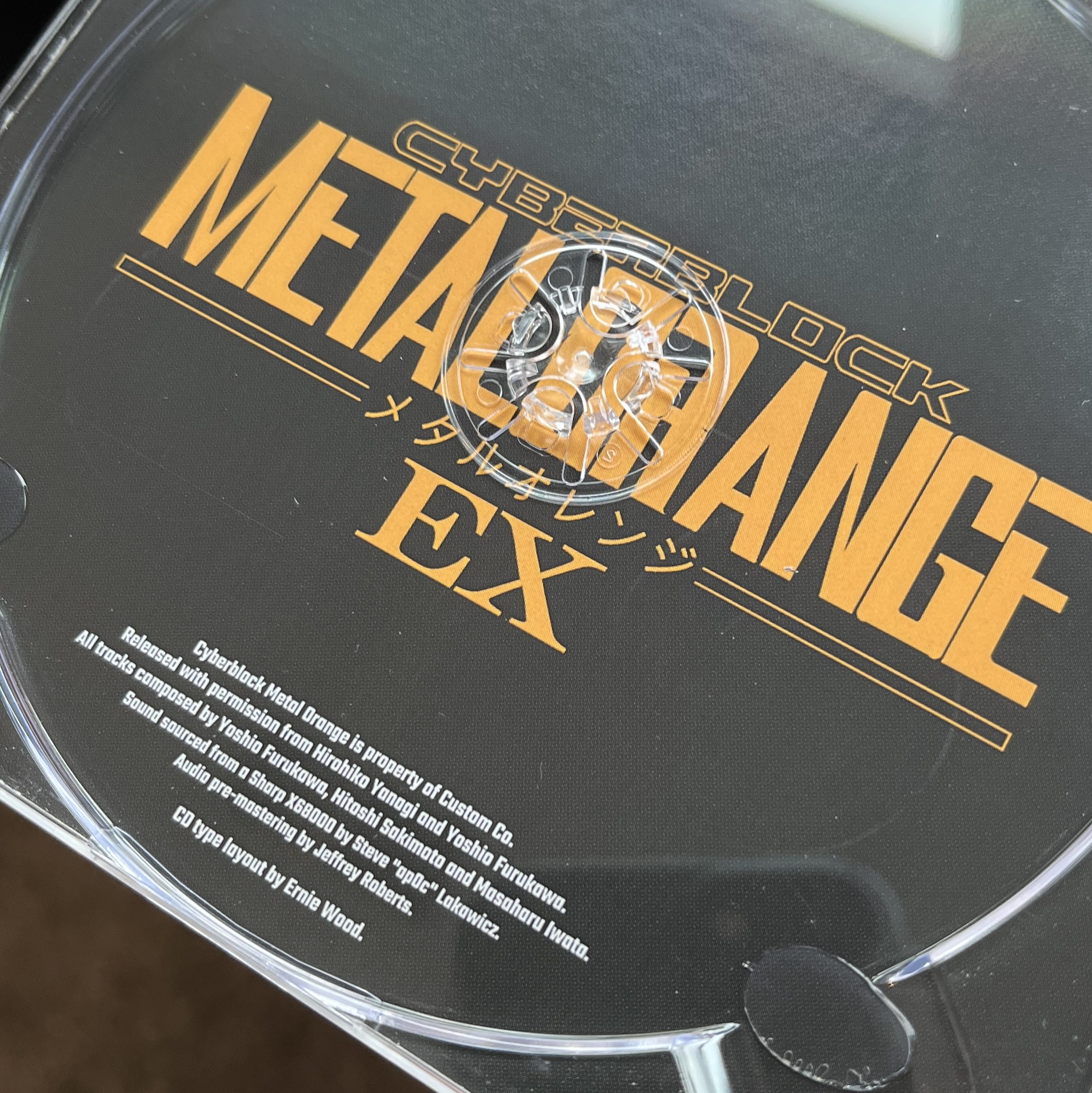
My first time designing a type layout for a CD! Like tapes, the smaller canvas can sometimes be challenging to get things feeling just right. For this one, the CD for Cyberblock Metalorange and Chip Chan Kick, I focused on symmetry in lieu of asymmetrical material to work with such as varying track numbers and the final result was clean and organized.


I got covid May of 2022 and for some reason one of the things that possessed me during that time was working on a Persona 5 Strikers lathe. I went through the game and captured high resolution photos of when they traveled to a new place, image traced them so I had vector lines to work with, added clouds as the border, and that became the center labels. For the tracklisting I went off of the CD design and used the fonts found there as well. Every asset was recreated by me, even the background with Joker. Even with it almost being 3 years ago now, I haven’t brought myself to make this lathe and I imagine as iam8bit chips away at Persona soundtracks this one is inevitable.
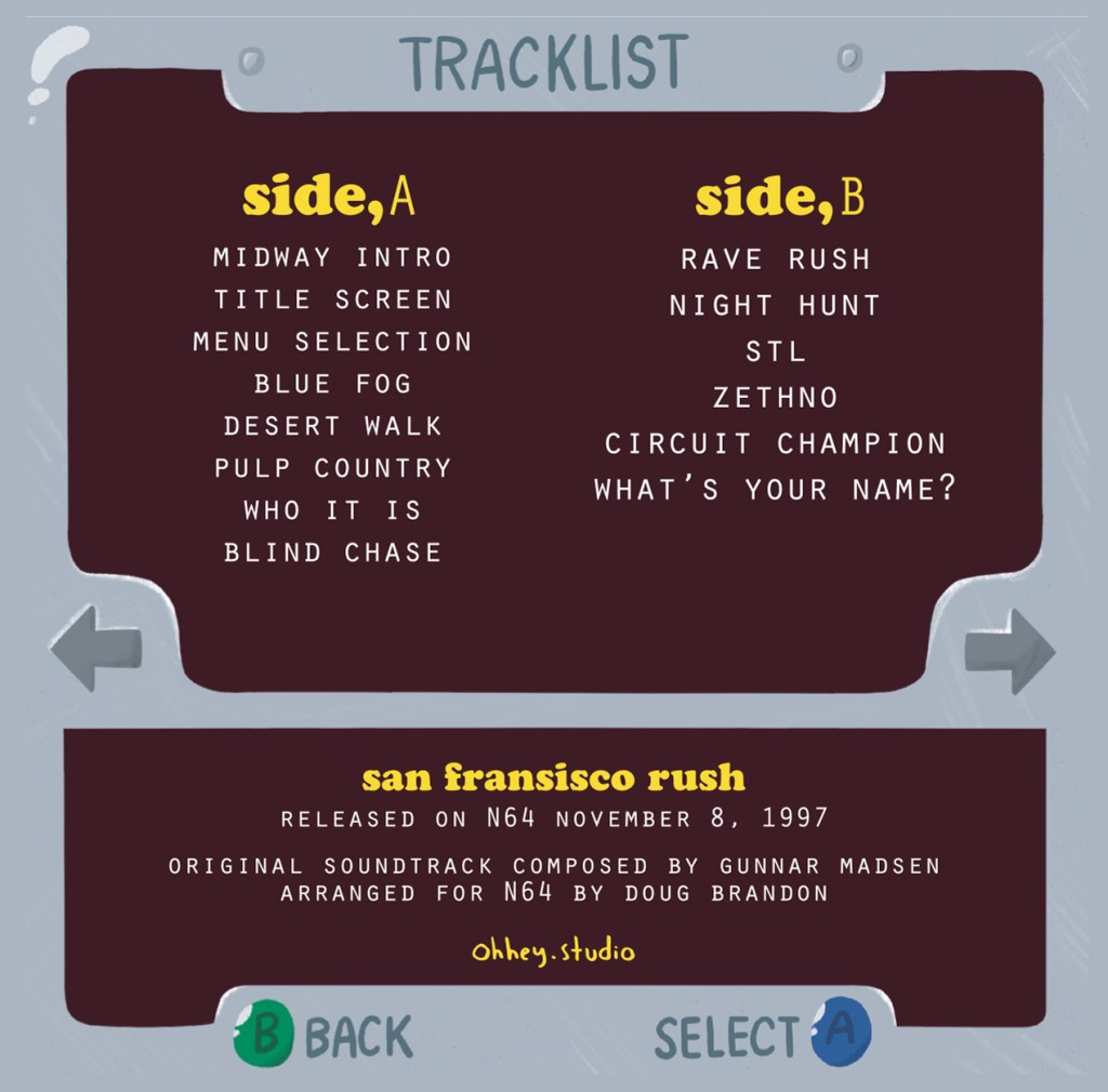
Early 2022 I did some artwork for a San Fransisco Rush lathe that was an homage to Frank Ocean’s album Nostalgia,Ultra. That artwork was then later repurposed into the form of a cassette tape, so in the SF Rush inspired menu illustration I set the tracklist in the same fonts used in Nostalgia,Ultra. I remember one of the fonts being surprisingly tricky to track down, but in the end it was worth the hunt!
In 2021 I was browsing Instagram and came across a vintage Final Fantasy VII Japanese release poster that I instantly fell in love with. Not wanting to pay vintage poster prices, I recreated the whole thing from scratch based on that one photo I found on IG. I found high res versions of these amazing character scenes from the original game, a high res version of the JP logo, and then a typewriter font like the original poster used for the release date text. Instead of the JP release date I went with the US release date, and printed off a copy for myself. Being able to do stuff like this for myself feels SO satisfying and I’ll never get tired of it.


A lot of Final Fantasy vinyl that Square Enix puts out is housed in these terrible plastic baggies, so I designed these jackets that were inspired by the CD designs and inserts that came with the vinyl records. I spent a lot of time on them to make them clean and cohesive, but unfortunately I have never gotten them printed. Maybe someday!
